Coaching Marketplace Platform - UX & Website Redesign
The Problem
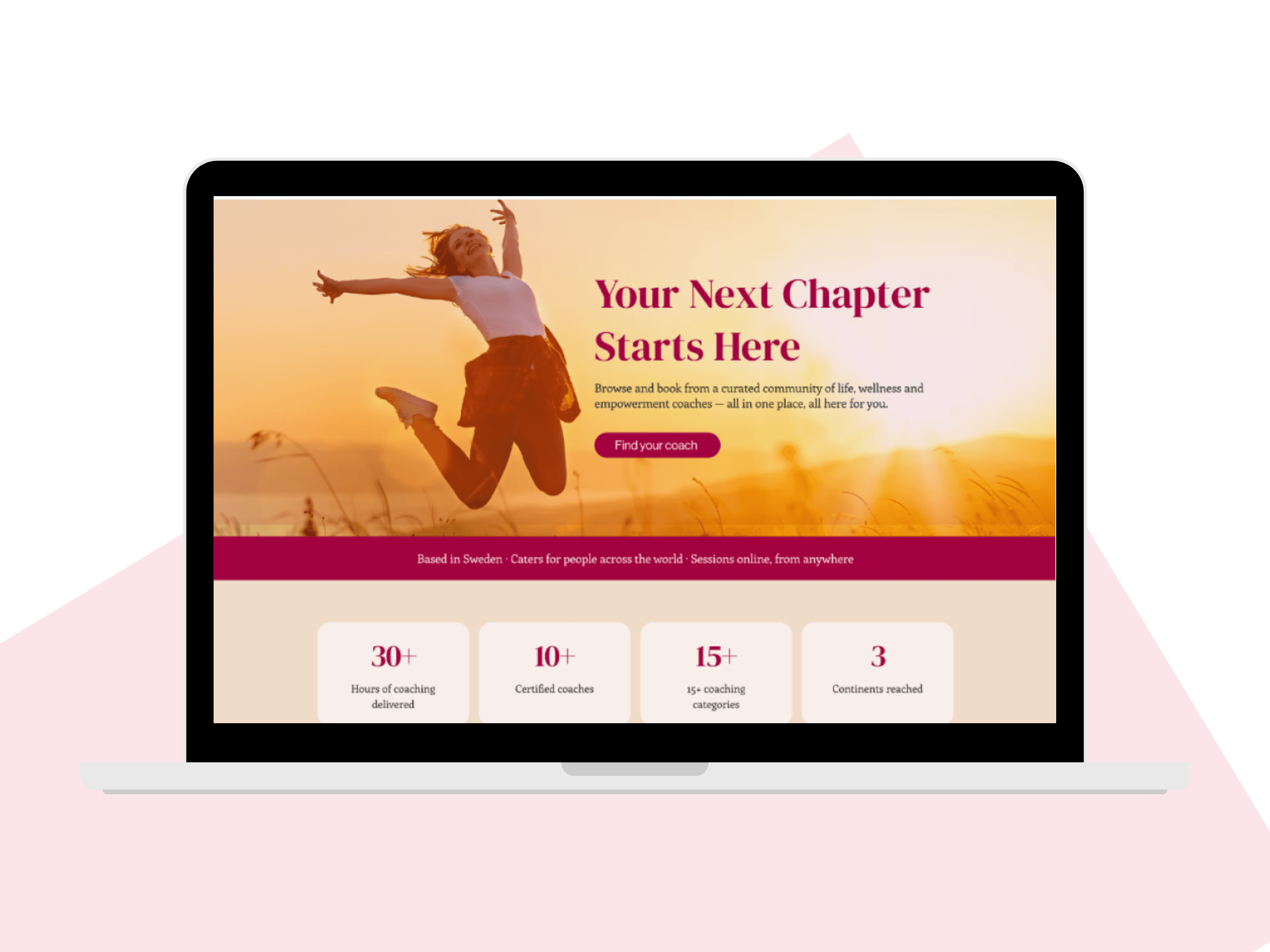
The client already had a website, but it wasn't converting and felt cluttered and disjointed. Beyond the homepage itself, every new coach who joined meant building another static profile page by hand, which wasn't sustainable as the business grew.
The Solution
I audited the existing site to find where users were actually dropping off, redesigned the homepage around a clearer path to booking, and built it in Wix. Then, instead of designing more static pages, I built a dynamic CMS system so every coach's profile - services, testimonials, bio - populates itself from a database, with no manual page-building required as the team expands.
Project Type:
Website Redesign & CMS Build
Timeline:
2 months
Tools:
Figma, FigJam, Wix, Wix CMS, Wix Bookings
in detail
Full Case Study
The site worked, in that it existed and had content on it. But it wasn't doing its job - people landed, didn't find a clear reason to stay, and left. And behind the scenes, the coach pages were static, meaning every new hire meant more manual design and dev work rather than the system scaling on its own.
DISCOVER
Finding out where people actually dropped off
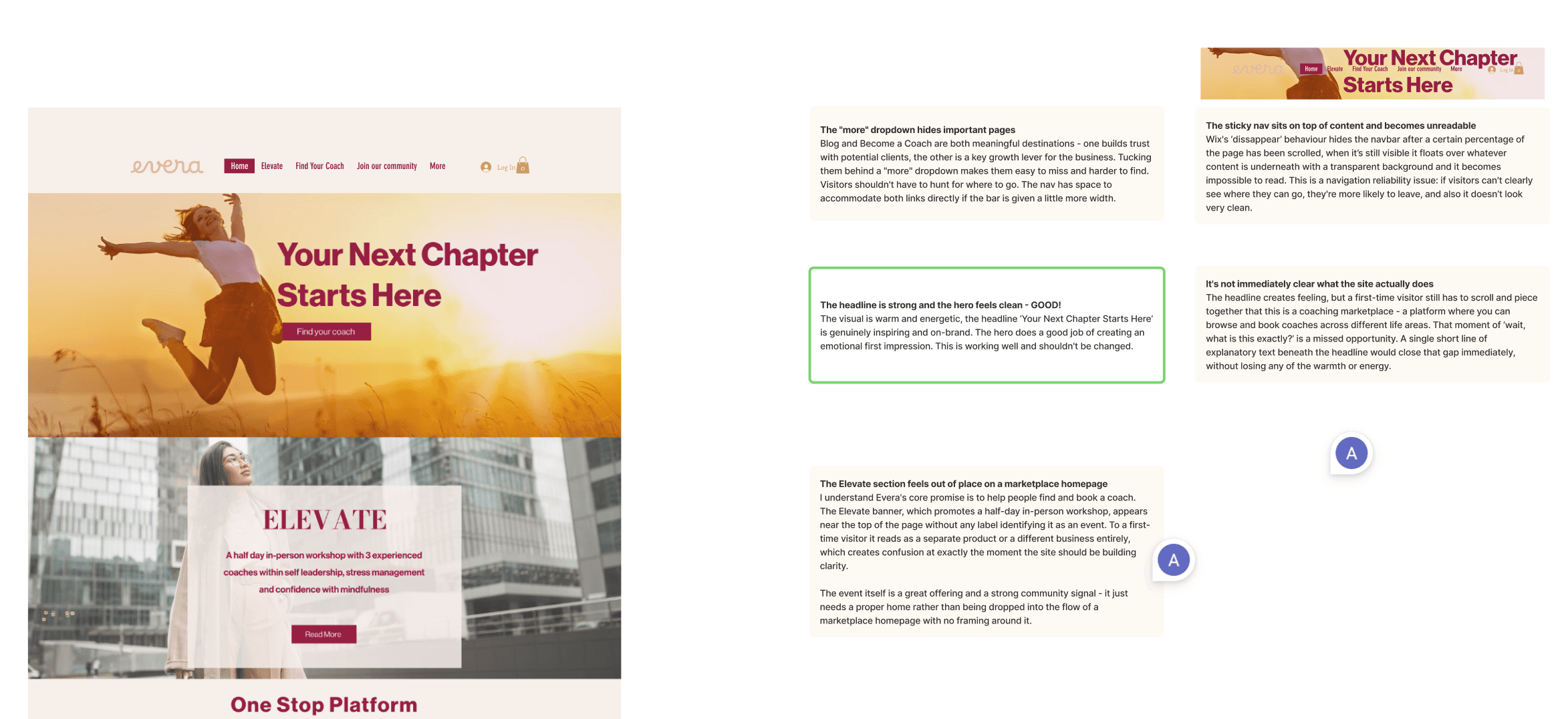
I started with a full UX and CRO audit of the existing site and its analytics - not guessing at what felt cluttered, but tracing where real visitors were losing interest and leaving.
That audit became a clear, prioritised list of friction points and specific recommendations, rather than a vague "this needs a refresh."
define
Agreeing the plan with the client
Recommendations review - agreed with the client what needed to change and why, based on the audit findings
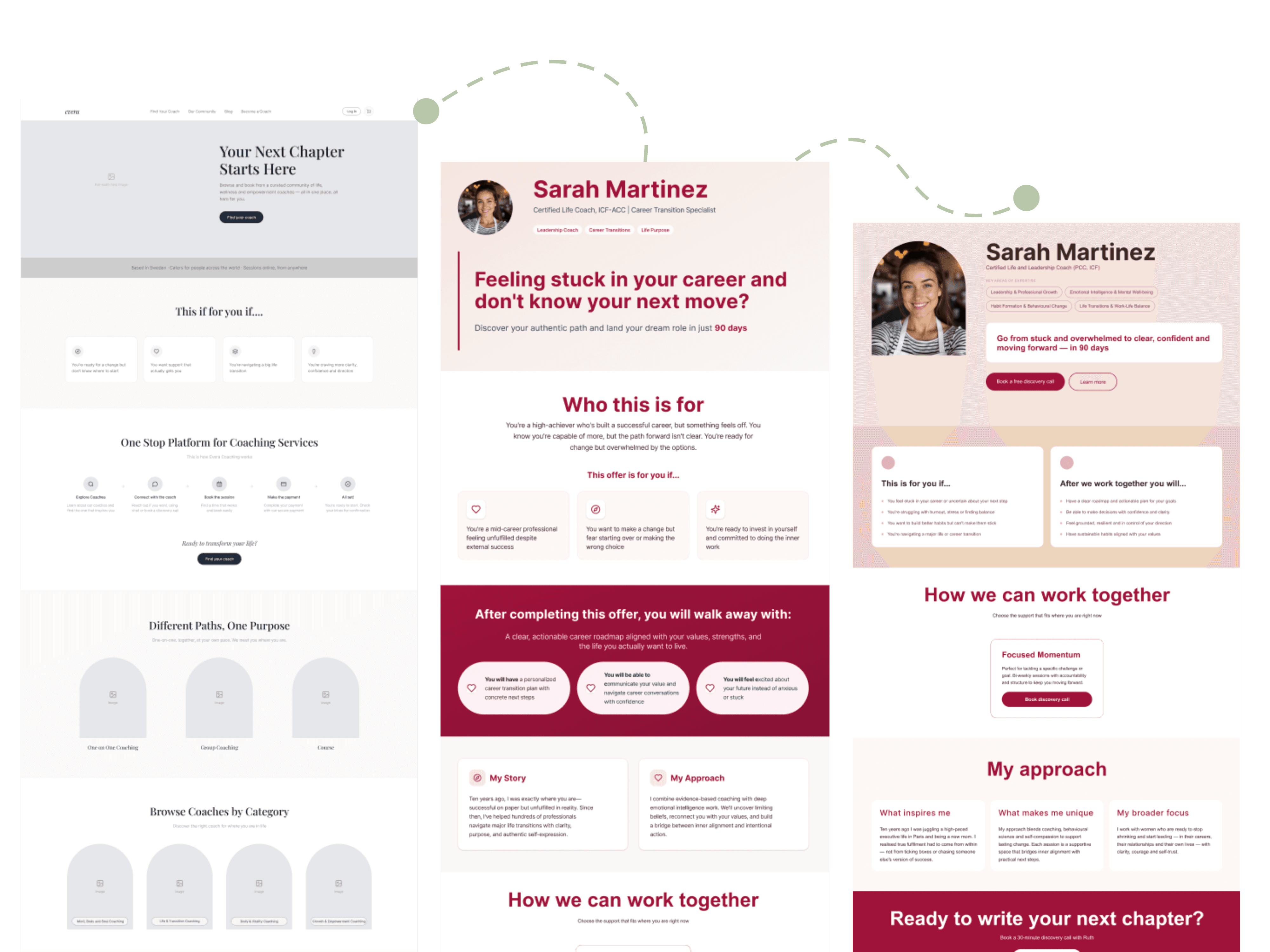
Design direction - presented low-to-mid fidelity concepts so the client could react to structure and flow early, before any visual polish was involved
Coach page system planning - mapped out how a CMS-driven system would connect to the homepage and booking flow, including what would pull from where and what the client would and wouldn't need to touch manually
design
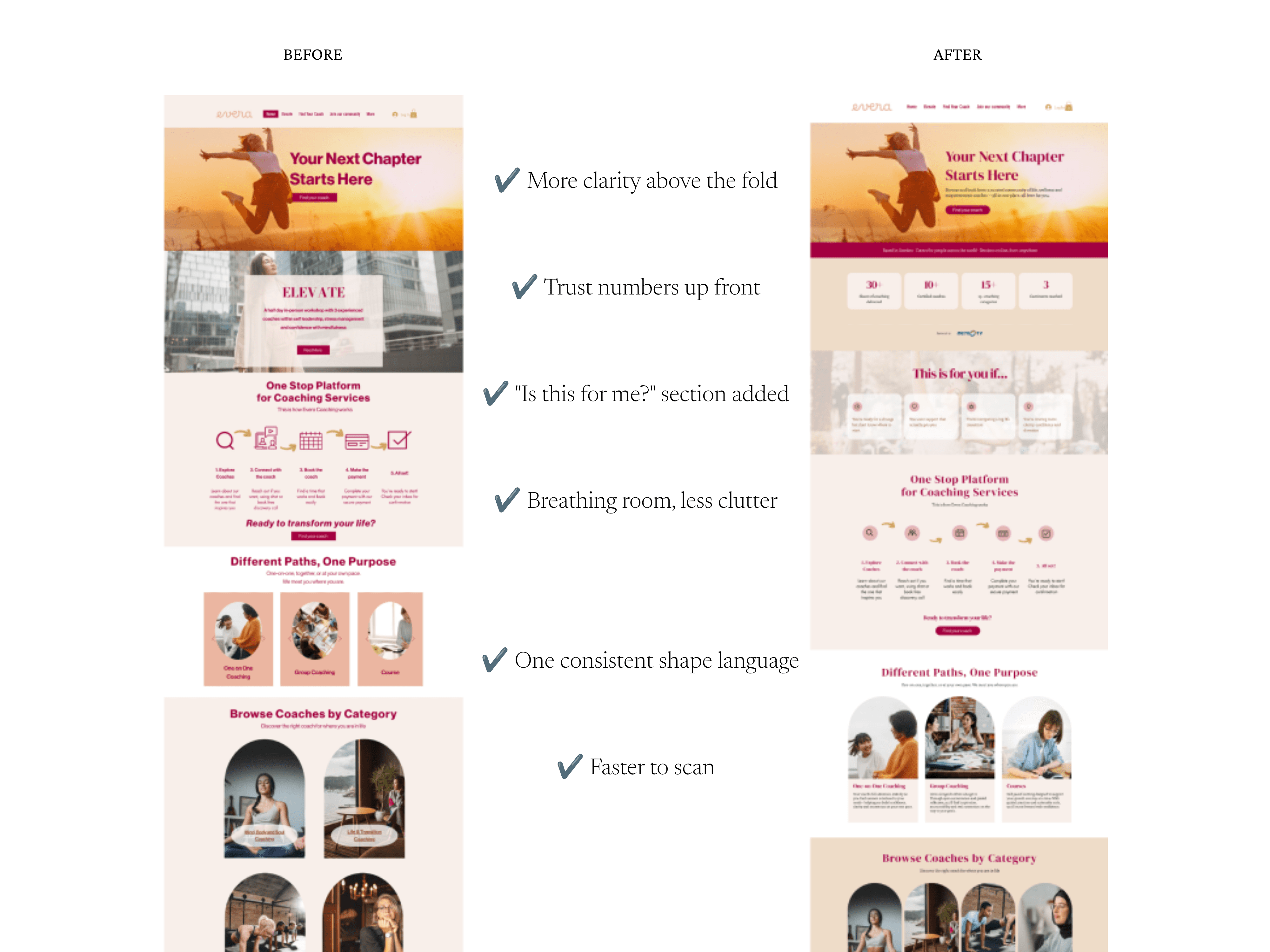
Rebuilding the homepage around one job: get people to book
Based on the audit, I designed a low-to-mid fidelity wireframe focused on a clearer structure, a more cohesive flow, and a straight line toward booking - then built it out in Wix, tightening the visual hierarchy, simplifying overloaded sections, and making sure it held up on mobile.
Pages that build themselves
This was the part that actually mattered long-term. Instead of designing more static coach pages, I built a fully dynamic system using Wix CMS. Every coach page pulls automatically from a database - name, title, bio, relevant services, testimonials - so adding a new coach means adding a database entry, not commissioning a new page.
Two pieces of logic made this actually useful day to day, not just technically dynamic:
Filtered services. All services live in one shared system, but each coach's page only shows the ones relevant to them.
Testimonials that adapt on their own. Testimonials sit in their own database, linked to each coach. A coach with five testimonials shows five. A coach with one shows one - no empty placeholder, no manual toggling.
deliver
A system the client can run without me
The end result isn't just a nicer homepage - it's a homepage that converts, sitting on top of a page system the client can expand indefinitely without touching design or code. Every new coach is a data entry, not a project.
What changed
Comparing the two months before launch to the two months after:
Bounce rate: 84% → 51% - far fewer people leaving after one page
Pages per session: 1 → 2 - people exploring instead of leaving on arrival
Session duration: 3m22s → 4m12s
Order conversion rate: 0.3% → 1.7%, orders up from 3 to 9, revenue up 153%
Confirmed bookings: 0 → 7
Leads: 7 → 10