Auditing and Repositioning an AI Styling App
The Problem
The founder wasn't getting enough users, and suspected the product's positioning was the reason - a simple "analyse your current style" tool wasn't compelling enough to convert or retain people. The plan was to reposition it into an ongoing coaching journey, built around closing the gap between a user's current style and the style they actually want.
What became clear at the start of the project was the product hadn't been tested from a real user's perspective, and it turned out there are some big UX and CRO issues that without fixing, may still prevent users from using the app after repositioning.
The Solution
I audited the app end to end, logged every friction point by severity, then built the new core journey in phases: a full user flow, low-fidelity wireframes, a spec document, and an app-wide UI hierarchy guideline, to support improvement and the reposition work. I stayed involved through early implementation to catch drift between what was designed and what got built.
Results
23
usability issues found and prioritised by severity
6
dashboard states collapsed into one dynamic system
8
core screens taken from rough concept to dev-ready spec
Project Type:
Redesign & UX Strategy
Timeline:
6 weeks
Tools:
Figma, Miro, Loom, Google Docs

in detail
Full Case Study
The app had been built largely solo by its founder, working with GPT to sketch out concepts. It worked, technically. But nobody had tested it as a real first-time user would, and the bigger idea - repositioning the product around closing the gap between a user's current style and their goal style - existed only as a rough idea, not something a dev team could build.
DISCOVER
Walking the app as a real user would
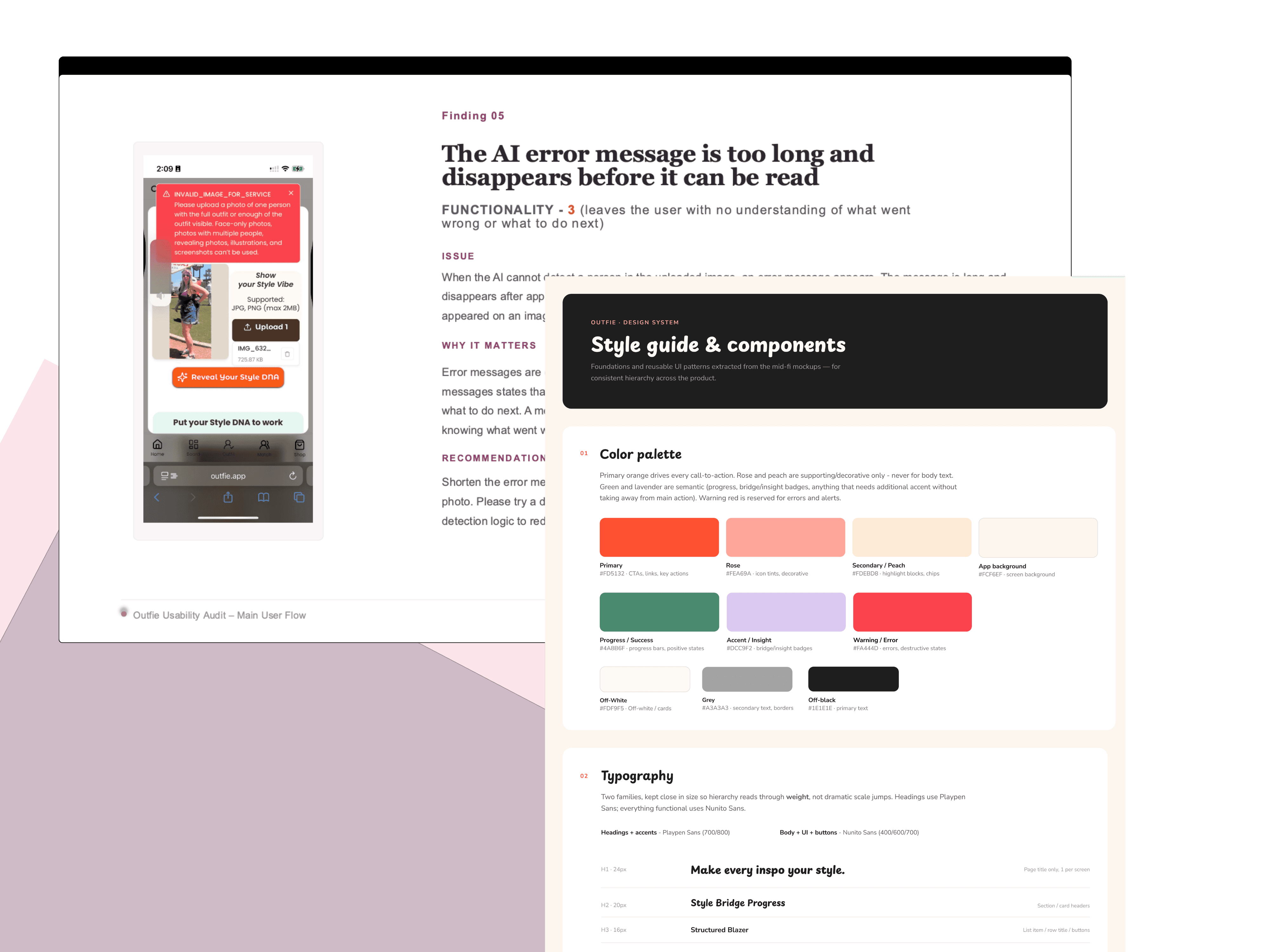
Before touching the repositioning, I ran a full usability audit - going through the app start to finish exactly as a new user would, logging every point of friction as I hit it. Each finding got a category (structure, design, functionality, or bug) and a severity from 1 to 5, so it was clear what needed fixing first.
The biggest issues:
Uploads failed for most iPhone users. JPG/PNG only, 2MB max - but iPhones shoot HEIC by default and standard photos exceed that limit. The core feature broke on the first thing most people tried to do.
A permission prompt was misguiding users. It said the app would work without location access. It didn't - declining it blocked the use of the app.
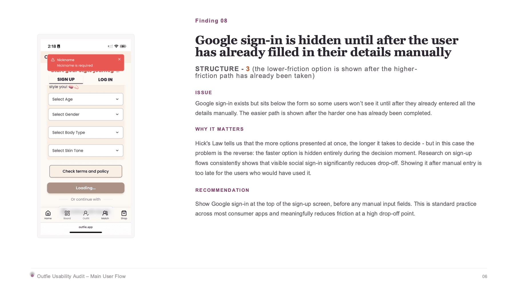
The easy sign-up option was hidden. Google sign-in existed but sat below a full manual form, so most people filled in everything by hand before ever seeing it.
A bug showed the wrong error in the wrong language. A nickname validation issue surfaced as a German message claiming the passwords didn't match, for a user with their device set to English.
New users had no idea what to do after signing up. The dashboard threw a wall of equal-weight options at them with zero guidance.
define
Fixing bugs and repositioning the product were the same job
Patching the audit findings alone wouldn't get the app where the founder needed it. Some of the worst issues - like the dashboard having no starting point - couldn't actually be fixed without first knowing what the new core journey would look like. So the plan became: fix the self-contained bugs immediately, and treat the flow and dashboard problems as part of the repositioning, not separate from it.
design
Building the new journey in stages
I worked through this in phases rather than all at once, partly to keep cost under control for an independent founder, and partly because a pivot this size benefits from checking in before committing further.
The new core journey
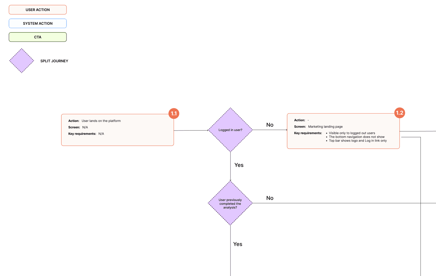
I mapped the full new-user flow - landing, current-style upload, goal-style upload, AI analysis, results preview, sign-up, full report, dashabord - with low-fidelity wireframes and a spec explaining the logic behind every screen: what's required, what's optional, what happens when something's missing.
One key call: instead of making users wait between each upload step, I recommended batching all three analyses into one loading screen after both uploads were done, with a visible progress counter and rotating content to fill the wait. Splitting waits between steps loses people before they've even signed up.
Collapsing the dashboard
The original plan had five or six dashboard states depending on user type. I collapsed this to three, based purely on what a user had actually completed - not who they were. One flexible system instead of a growing list of near-duplicate screens.
Turning the fixes into rules, not one-offs
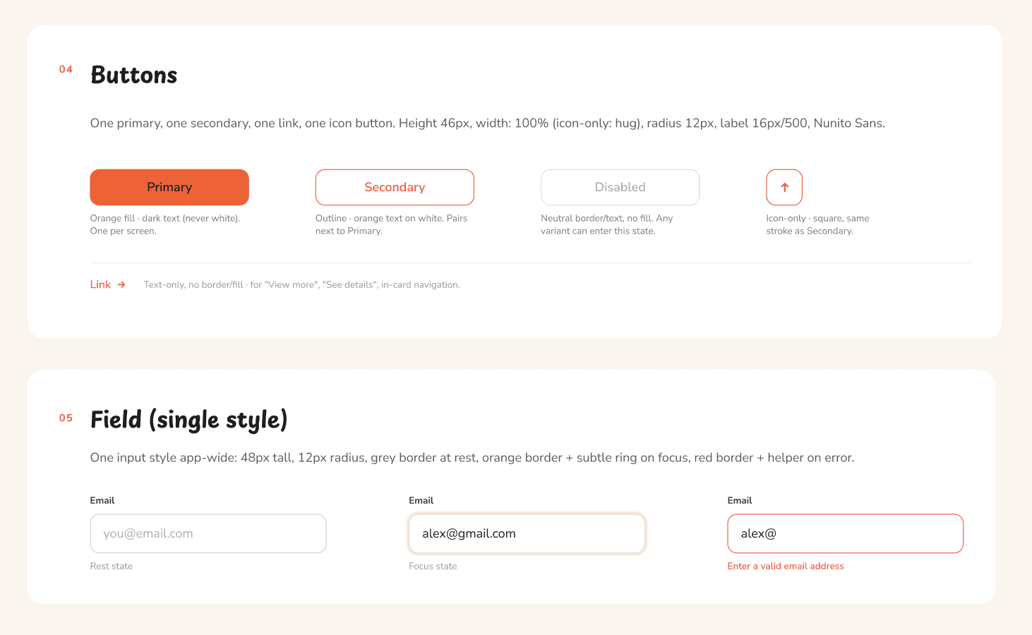
Once the flow held up, I built an app-wide UI hierarchy guideline - typography, buttons, cards - with annotated wireframes as a concrete reference, so every future screen could be checked against the same logic instead of reinventing it.
The screens that mattered most
Last, I detailed the landing page, the dashboard's progress section, the guided analysis sequence, and the results report - defining exactly what each screen should show and how it should flow.
deliver
Catching drift before it became rework
I stayed involved as the dev team started building, reviewing early implementations against the spec and flagging where they'd quietly drifted - a leftover reference to an old feature name, a state that should've been removed. Catching things early meant nothing had to be rebuilt because the team was working from a stale version of the plan.