Diagnostics Integration: UX, Workflow & Service Redesign
The Problem
Our existing diagnostic service operated within a third-party unintegrated system, leading to a fragmented user experience and considerable manual work. This lack of integration caused:
Increased patient - contact centre agent interactions: Agents spent valuable time manually processing lab test orders.
Inefficient workflows: Admins juggled multiple systems with inconsistent data access.
Operational risks: Lack of clear process ownership created potential data-handling issues.
Poor user experience: Patients faced delays and lack of transparency in booking and accessing diagnostic services.
The Solution
I redesigned the system in three phases: automated result uploads first, then a unified admin interface, then direct patient booking - removing the manual steps one by one.

Results
50%
reduction in patient contact centre interactions for lab test ordering
±200
minutes of contact centre agent time saved per 100 tests done
90%
less development rework required
Project Type:
Workflow & Product Redesign
Timeline:
12 weeks
Tools:
Figma | Miro | Microsoft Forms

in detail
Full Case Study
The diagnostic service was running on a system that didn't talk to anything else. That meant everything downstream was manual - agents typing orders in by hand, admins juggling multiple tools, and patients left waiting without much visibility into what was happening.
*Due to client confidentiality, the designs shown here are my own recreations - built to demonstrate how I approach this kind of problem, not the actual shipped product."
DISCOVER
Figuring out what was actually going on
Before I touched any screens, I needed to understand how this played out for the people living it every day - agents, admins, and patients.
Talking to the people doing the work
I ran workshops and interviews across every group involved. I shadowed contact centre agents to watch, step by step, what "manually processing an order" actually looked like. I talked to admins about where handovers between tools kept falling apart. And I sat down with operations managers to find out where SLAs were being missed and why.
Mapping the whole journey
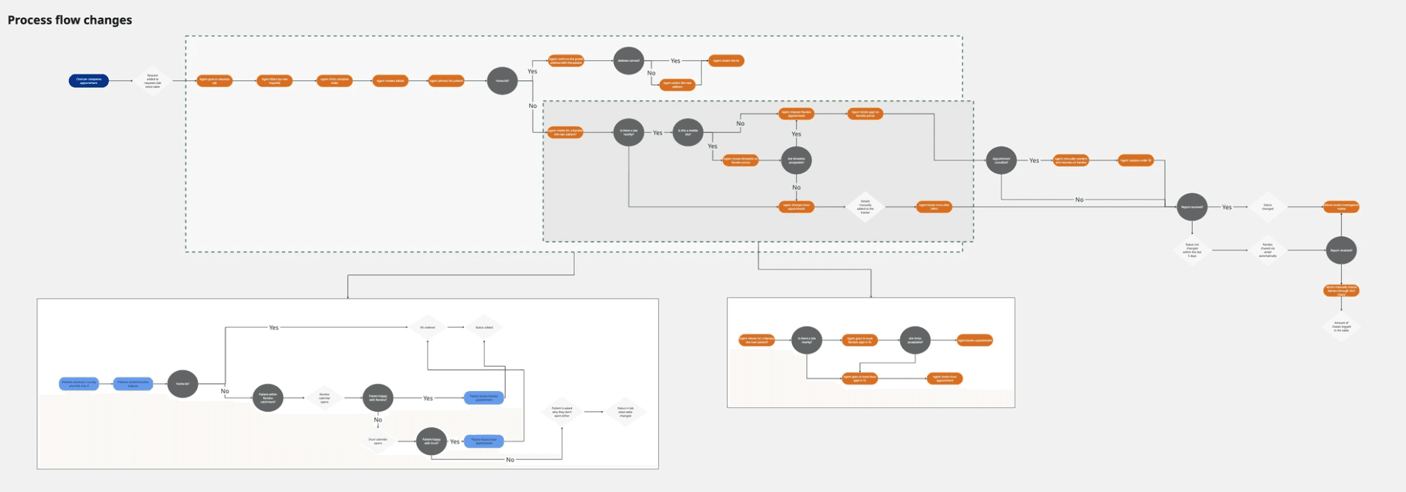
Together, we mapped the complete diagnostic journey - from a patient's first request all the way to getting their results - capturing both what people saw on screen and everything happening behind the scenes that they didn't. Doing this out loud, as a group, was where the real "aha" moments happened. People started noticing redundant steps and dropped handoffs they'd just been quietly working around for months.

This mapping surfaced a lot: repeated tool-switching, manual data re-entry, and feedback loops between teams that just... didn't loop back.
define
Turning the mess into a clear problem
Once we understood what was actually happening, the next job was translating all of that into something specific enough to design against.
What we were solving for
We pulled together everything from the research and prioritised it by impact - on the people using the system, on data accuracy, and on the business. From there, four clear goals emerged:
Reduce agents' manual workload by automating the parts of ordering that didn't need a human
Simplify admin work so people weren't hopping between systems all day
Build trust and satisfaction for everyone in the loop - internal staff and patients alike
Tighten up data consistency and security across every connected system
How we'd know it worked
We set metrics to track alongside this - things like SLA adherence, time saved for internal teams, and satisfaction scores from both staff and patients. Not vanity numbers, just: is this actually better for the people using it?
design
Designing the fix
With a clear problem in hand, this is where things got collaborative. I didn't want to just redesign the interface - the goal was to rethink the whole service, screens and workflows and data connections together.
Getting developers in the room early
I ran a brainstorming session with the dev team to sketch out what an ideal journey could look like, while making sure whatever we designed was actually buildable within the existing system architecture. This is a step I've come to see as non-negotiable - designing in isolation from engineering just means redoing the work later.
To help everyone see the difference clearly, I built side-by-side flows showing the old process next to the proposed new one. This made it much easier for stakeholders to immediately see where steps disappeared and where friction dropped away, instead of having to imagine it from a description.
A phased rollout, on purpose
Given how much this touched, we didn't try to fix everything at once. Instead, I proposed three phases, each one delivering something useful on its own while building toward the full picture:
Automatic result uploads - get the basic data pipeline working so results transferred securely without manual handling.
Order integration and a unified admin view - one interface where admins could manage every diagnostic request without switching tools, with a clear trail of who did what.
Patient booking, built in - let patients book tests, pick their lab, and see their results directly, cutting out a lot of the manual follow-up that used to fall on agents.
Getting it in front of people, early

Once the direction felt solid, I moved into wireframes - deliberately kept at mid-fidelity so they were quick to react to and easy to change. I walked stakeholders through these alongside the flows and the phased plan, so we could catch misalignment while it was still cheap to fix, rather than after months of build.
I was also building this within a broader design system I'd put together, which kept things consistent and meant development could move faster once we got there.
Making it real enough to test
Wireframes only get you so far. I built clickable Figma prototypes covering both the admin and patient sides, so the team could actually walk through the redesigned service end to end - from a patient requesting a test, all the way to getting results back. Having something people could click through, rather than just look at, made technical conversations faster and a lot less abstract.
deliver
Testing it, fixing it, testing it again
This wasn't a one-and-done testing phase - it ran continuously, and it's where the design actually earned its stripes.
Getting real feedback
I ran testing rounds with contact centre agents, admins, and patient representatives. The goal wasn't just "does this look fine" - it was making sure the redesigned workflows genuinely cut down on manual steps, prevented data errors, and made moving between tasks feel smooth instead of jarring.
Actually using what came back
Every round gave us something worth acting on. I logged what people ran into, prioritised the issues that mattered most, and iterated - sometimes going all the way back to an earlier design decision if that's what the feedback pointed to. That's not a failure of the process, that's the process working.
Staying aligned with the people building it
Throughout, I kept meeting regularly with engineering, the product owner, and business leads - sharing what testing was surfacing and making sure what we were designing stayed realistic given technical constraints and what the business actually needed.
What changed
50% fewer patient calls to the contact centre about lab test ordering
±200 minutes saved per 100 tests, just from cutting out manual agent work
90% less rework for developers, because the flows were validated before anyone started building
100% admin satisfaction, measured after rollout
Noticeably less tool-switching and manual data entry across the board
Better data consistency and a clearer audit trail across every connected system