Redesigning the Patient Dashboard for Better Guidance and Retention
The Problem
The platform hadn't been updated in years, and most users were either brand new or returning after months away - so almost nobody was familiar with it, but the learning curve was still high. Around 40% of users dropped off right after landing on the dashboard, without taking any meaningful action.
The Solution
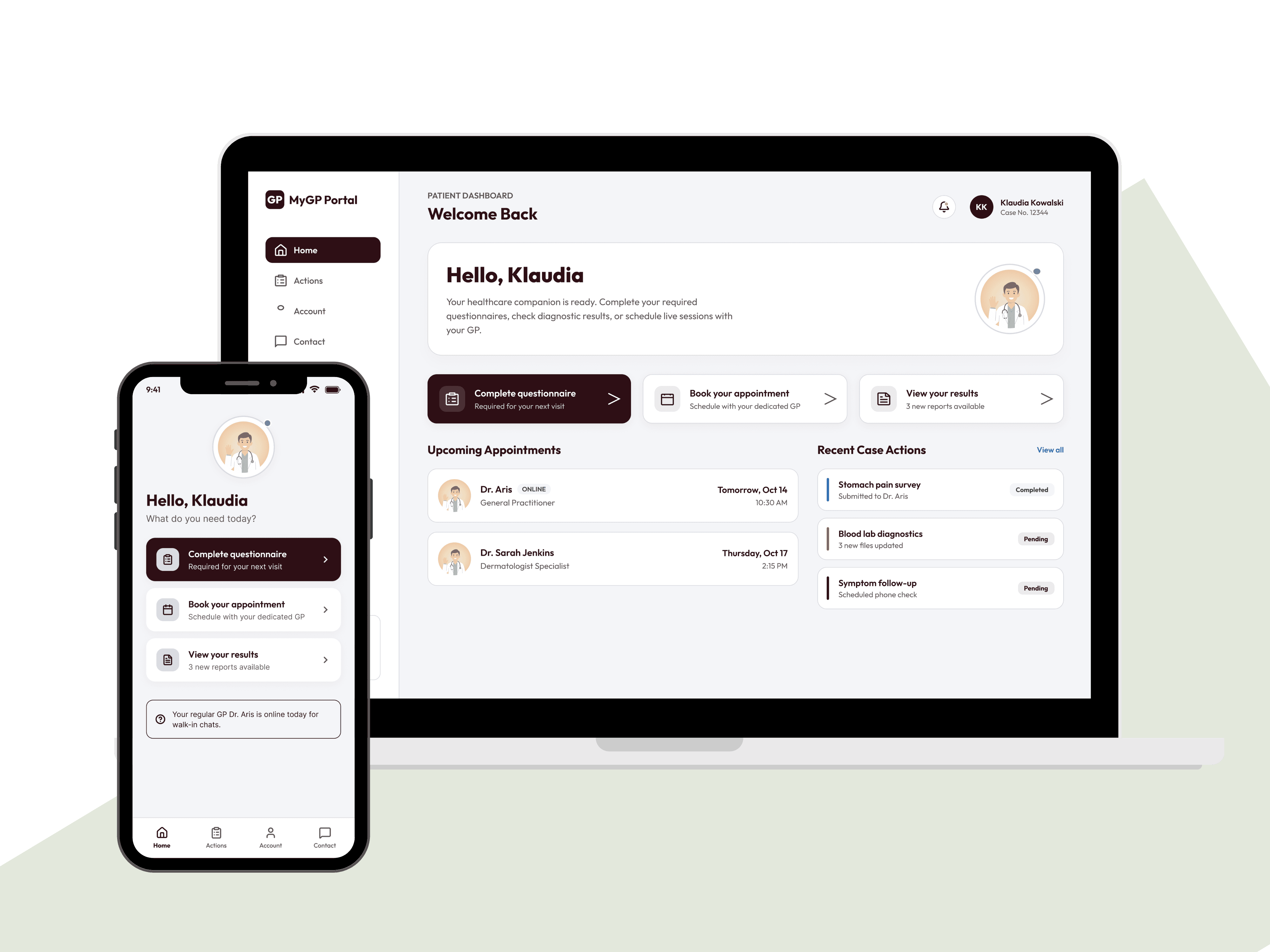
I ran testing with real users to find out why, then redesigned the dashboard around clear next steps instead of various competing actions - replacing an external product tour with a native guided flow that explained itself.
Results
37.5%
fewer users dropping off after sign-up
12% → 2%
drop in confusion-related feedback
Gone
The old product tour - the flow explains itself now.
Project Type:
Product Redesign
Timeline:
3 months
Tools:
Figma, Miro, Jira, UserTesting.com

in detail
Full Case Study
The platform hadn't been touched in years, while most users were either brand new or coming back after months away - so almost nobody had built up familiarity with how it worked, yet the dashboard still assumed they had. It threw four or five options at people the moment they logged in, with no clear starting point. For patients who were often dealing with pain and just wanted to know what to do next, that uncertainty was the whole problem.
*Due to client confidentiality, the designs shown here are my own recreations - built to demonstrate how I approach this kind of problem, not the actual shipped product."
DISCOVER
Figuring out why people were leaving
Before redesigning anything, I needed to understand what was actually happening at that drop-off point.
Looking at the data and the feedback
Analytics showed a clear pattern - people were dropping off right after landing on the dashboard. Patient feedback backed this up: about 12% of comments specifically mentioned not knowing what to do next.
Talking to real users
I ran testing sessions with 12 participants, a mix of new and returning patients. The pattern was clear almost immediately: people didn't know where to start. The dashboard threw four or five competing actions at them with no clear direction. Most were MSK patients, often dealing with pain and just looking for quick, reassuring guidance - instead they landed on a page full of options and no obvious next move.
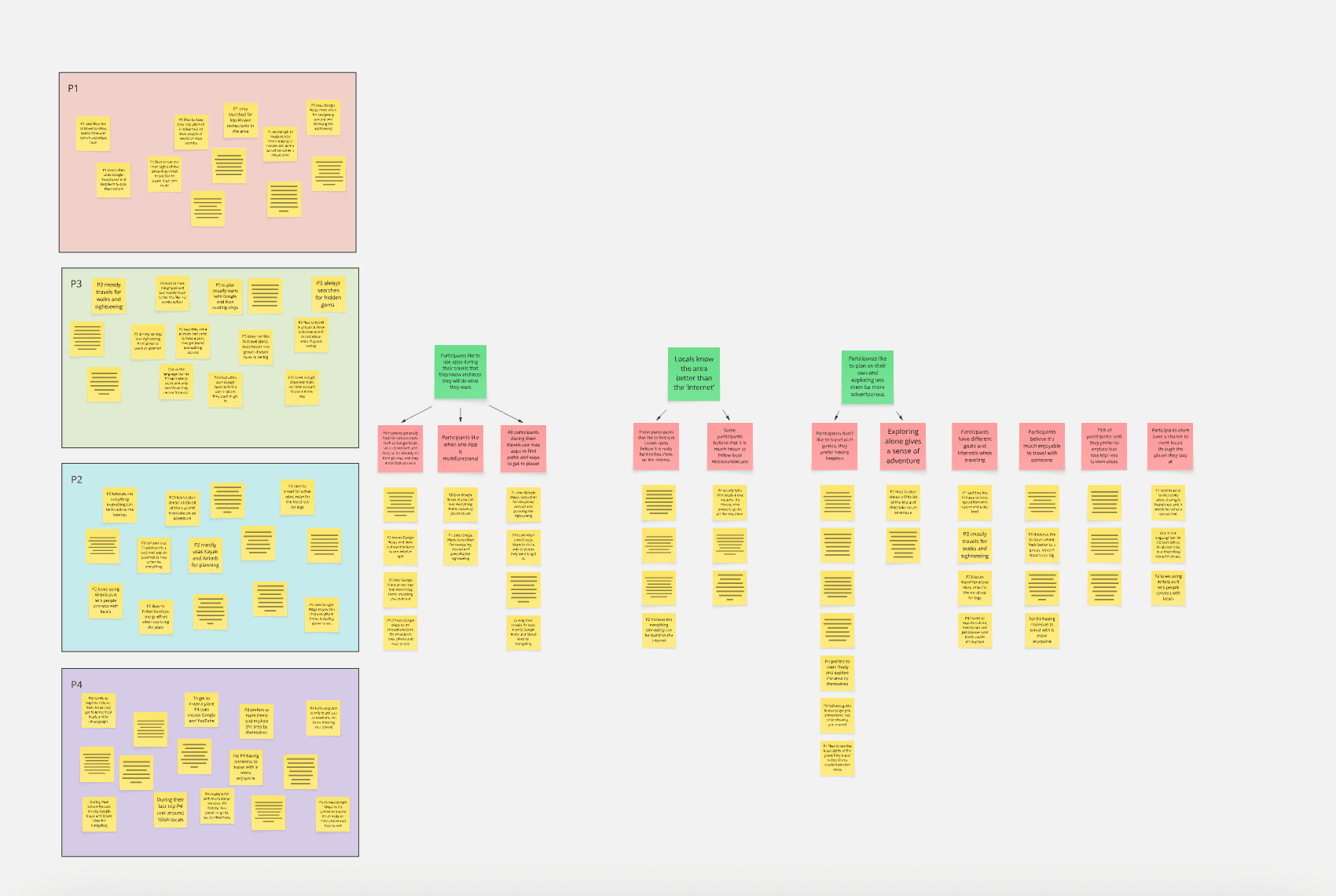
Image 1: Miro board with the notes from interviews.
define
Turning that into a clear direction
Two insights shaped where I took the redesign:
Clarity beats flexibility. People didn't need five options laid out for them - they needed one obvious next step.
Progress builds confidence. Showing someone that one action leads to the next keeps them moving instead of stalling out.
I also looked at how other healthcare and wellbeing products handle onboarding - specifically how they guide people right after sign-up, structure step-by-step flows, and manage multi-part tasks like questionnaires.
design
Designing around one clear next step
I went through six iterations of the dashboard, working closely with the product team and developers to keep the ideas both usable and buildable.
A "next steps" page
After logging in, users now land on a simple page that tells them exactly what's next, based on their specific condition - no more guessing.
One guided first action
The dashboard now surfaces whichever action matters most for that specific patient (determined by a weighting system built with operations managers on the backend) as the one prominent thing to do. No menu, no guessing, just the next right step for them.
Smart follow-up prompts
Once someone finishes a questionnaire, a simple prompt appears: "Thanks for sharing. You also need to complete this next questionnaire - would you like to do it now, or head back to your dashboard?" It keeps momentum going without forcing it.
Cutting the old product tour
The platform used to lean on a static, external walkthrough as a workaround for unclear UX. It helped a little, but once the flow itself became self-explanatory, the tour just wasn't needed anymore.
deliver
Testing it with real people
I tested the prototypes with 10 new users through usertesting.com. The feedback was clear, simple, and reassuring — people found it easy to follow. A few small tweaks came out of it, mostly around labels and button placement.
What changed
Drop-off after sign-up was reduced by about 37.5%
Patient comments about confusion fell from 12% to 2%
Support queries about "what to do next" were almost entirely eliminated
The product tour was removed - the design no longer needed one
What I learnt
Involve developers early. My first few iterations weren't feasible within the existing tech setup - getting engineers into the conversation sooner saved real time later.
Don't lean on a tour to fix unclear UX. If a design needs an explanation to make sense, it isn't clear enough yet.
Progress and reassurance matter most. Especially for people in some kind of distress or discomfort - clarity is what actually builds trust and gets people to follow through.